Review
Memorable
Effective
Style
Heart or Humor
Execution
Fail!
Confusing
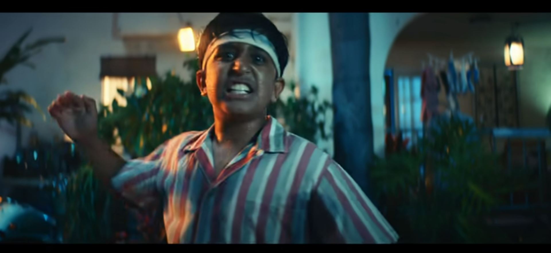
There’s taking an edgy approach, then there’s taking a full on controversial one. In this review, we take a look at the interesting and slightly questionable Philco TV ad created by Mercado McCann called “Euthanasia”. Have a read through our breakdown of this unorthodox concept and see if we shared your reaction.
Memorability – 7 / 10
It sure is memorable, but for the right reasons? The idea of a TV commercial surely must be to capture the attention of an audience and leave an impression that lasts until they take action. This concept is so “on the edge” we fear it might leave many viewers with a more confused memory than a clear and concise one. It’s a compelling merge of two seemingly unconnected concerns but it does just enough to leave viewers vaguely aware of the brands’ core message. It might take most consumers several times of re-watching the ad over and over before they grip the meaning behind it. Perhaps on some level that’s the director’s actual plan with this piece.
Effectiveness – 6 / 10
The idea of the ad is to remind users that their technology is degrading and it’s ok to “let it go” so that you can replace it with a new modern version. This idea feels like one of those creative concepts that sounds great academically and on paper, but in reality, for all kinds of reasons doesn’t quite make the cut. This one, however, did make it. The one thing that can be said about this ad is the fact that it’s certainly worth talking about. You might even talk about it negatively when pondering its uniqueness with other people, but the fact remains regardless, you’ll actually be talking about it.
Style – 7 / 10
It’s purposefully filled with darkness and melancholia themed visuals with a soundtrack to match. This adds the full flavor of euthanasia to the piece. So much so that you could almost understand it’s subject matter even with the volume turned right down to zero. Is this level of darkness necessary? It seems perfectly plausible to create a more clearly humorous and lighthearted ad that plays on the idea of letting technology go when it becomes outdated. But then again, would that be far too similar to normal and just like every other technology ad ever conceived? In this industry, normal isn’t a good thing, so this euthanasia link certainly ticks the box for “standing out and being counted”.
Heart or Humor – 7 / 10
Some sentiment actually pays a role here, but the ovehewlemig sense is that this ad is trying to make light on an otherwise exclusively dark subject. Only viewers with direct experience of real euthanasia circumstances are likely to find this idea distasteful. Everyone else will relate right away with decaying devices that are letting them down and see this concepts funny side. Slow close-up cinematography captures the scenes in a similar way you would expect the luxury food to be shot. The comedic value plays clearly throughout, and viewers who take in the entire clip will certainly be left understanding the brands’ comedic agenda.
Execution – 7 / 10
The core objective of the concept may well be to split people’s opinions. Is it an acceptable comparison to make? Should the subjects be linked with such “graphic” connectivity? Everyone will have a different opinion to share, and for that reason alone the ad may well be considered a fleeting success. Many would quote the argument, “there’s no such thing as bad press.”


