Review
Memorable
Effective
Style
Heart or Humor
Execution
Here we take a look at “Perfect Moments“, Cannons latest brand awareness TV commercial. The advert was created by the advertising agency Grey, NY, USA. We analyze this colorful commercial most impressive features as well as what it might be missing. We’ll give the commercial a score out of 10 for memorability, effectiveness, style, humor, and overall execution. Have a peek at our review and see if our first impression matches yours.
The slogan is “Being at the right place at the time means nothing without the right camera. Be prepared and own the moment with the Canon EOS Rebel T7i.”
Memorability – 9 / 10
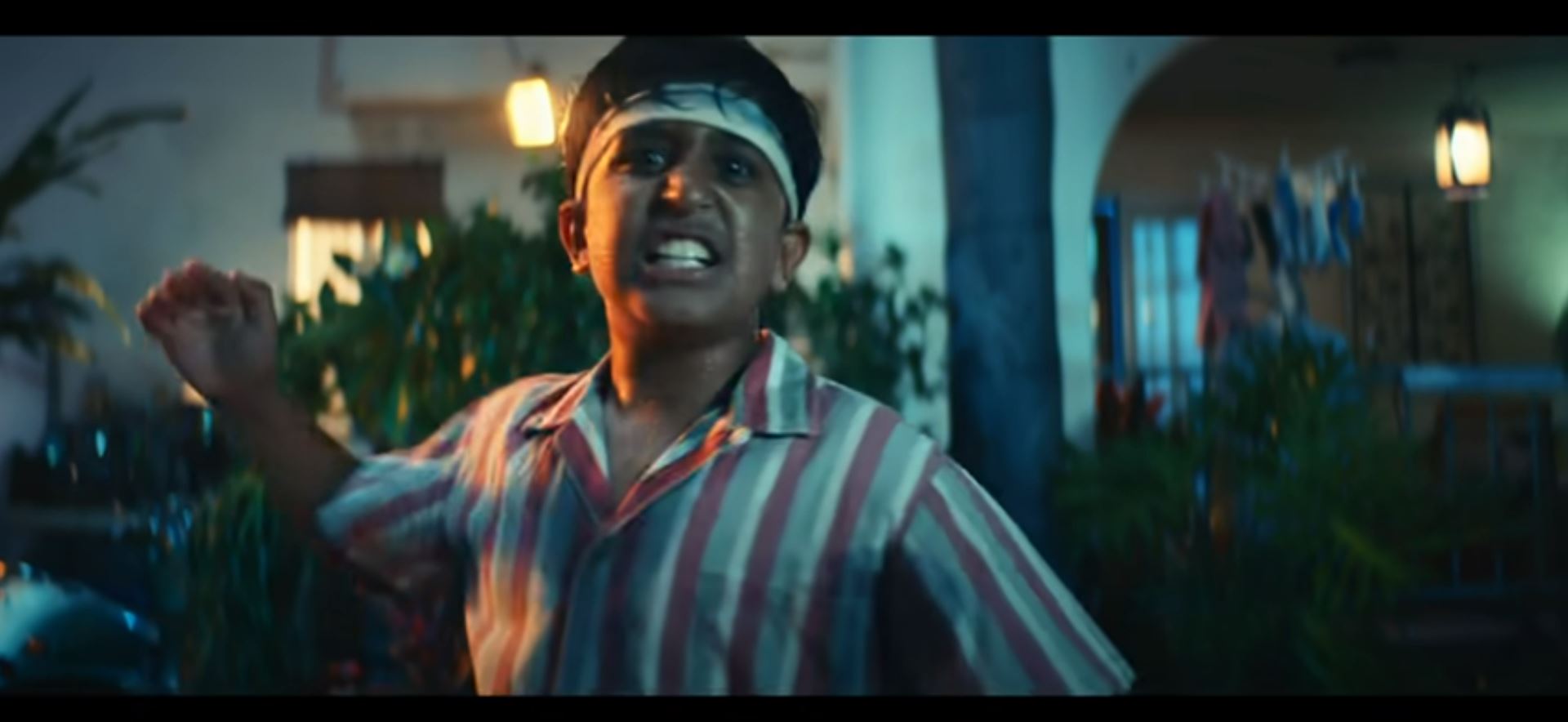
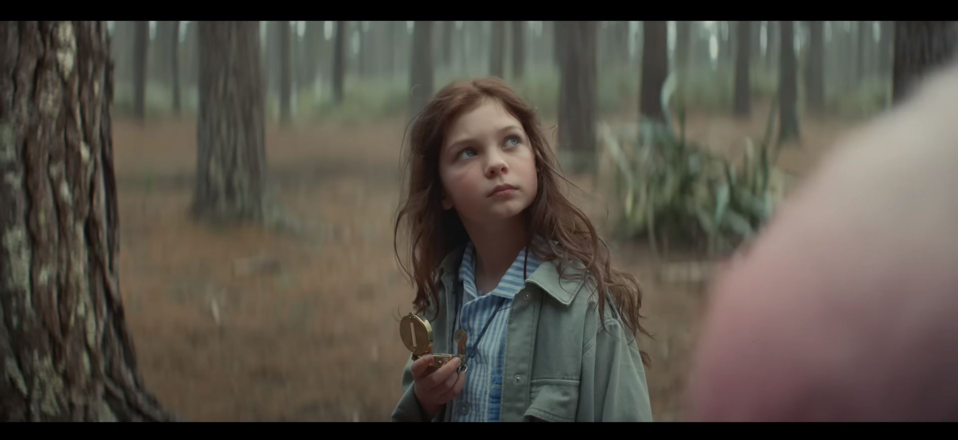
Nothing sells cameras like the color. This concept feels like a solution to the question, “how can we fit as much color into a 2-minute clip as possible?”. If their prime objective was to wow the audience into a sense of admiration, the job was done. The content is undeniably cool and very easy to remember. Vibrant colors and a clever use of visual content with maximum impact combine to make the entire sequence stand out from the crowd.
Effectiveness – 8 / 10
Canon is a world renowned premium brand that needs to dig its claws into the rapidly growing sea of millennials that are increasingly obsessed with quality photography. This ad is effectively Cannons shout out, as well as a clip that most would expect will gain some great levels of shares and traffic online. The ad certainly covers an ideal that many millennials will find very easy to relate to. Amazing photos are becoming an essential element of modern entertainment and the content in this commercial should certainly prove catchy as well as directly in line with how many young people will feel towards the subject – “It’s all about being in the right place at the right time”.
Style – 8 / 10
The ad has been set in a picturesque town location with an abundance of colorful attractions to make a mess of. The lighting and color combinations will remind many young viewers of visuals from holidays and celebratory events, which will enact a sense of positivity towards the visuals. All the action in the sequence is fine tuned and runs flawlessly. The sequence is utterly filled with continuous business, which goes a long way in instilling a feeling of quality throughout the choreography. A lot of work has gone into making sure all the final shots are out of the ordinary as well as incredibly beautiful to look at.
Heart or Humor – 8 / 10
The ad has as much humor in it as it does the heart. From the old lady who drives needlessly into a pole 3 feet in front of her, to the boy who kicks the ball straight at a pile of delicate flowers for some bewildering reason, each step of the sequence becomes increasingly nonsensical (and unrealistic) in order to communicate the core message with humorous edge – “You need the best equipment, if you want the best shots”.
Execution – 9 / 10
If you wanted to be extra picky, some might say it’s a bit of a shame that the ad doesn’t actually promote any particular feature or design, as the concept has more than enough gravity to highlight a specific function brilliantly. For the rest of us, the complexity and clever use of color in the ad are dazzling enough to act as a very accomplished pure brand awareness clip.
Credits:
Advertising Agency: Grey, NY, USA
Deputy Chief Creative Officers: Jeff Stamp, Rob Lenois
Executive Creative Director: Brad Mancuso Group
Creative Director: Susan LaScala Wood
Copywriter: Chris Hanrahan
Art Director: Mike Lubrano
Art Director: Mackenzie Keck
Copywriter: Paul Curry
Designers: Cassie Meyers, Angela Kim
Partner: Rick Reilly
Account Director: Nikki Maizel VP
Account Director: Sam White
Senior Account Executive: Abel Flint
Assistant Account Executive: Hanna Cannell
Strategy Director: Steve House
Executive Production: Townhouse
President: Bennett McCarroll
Director of Integrated
Production: James McPherson
Producer: Jennifer Truss Music
Producer: David Steinberg
Production Company: Big Block
Director: Jonathan Zames
Production Designer: Jay Pooley
DOP: Andre Szankowski
Editor: Jai Shukla, Nomad Music
Sound Design: Peter Holcomb
Sound Lounge Principal Talent: Lauren DeCiccia


